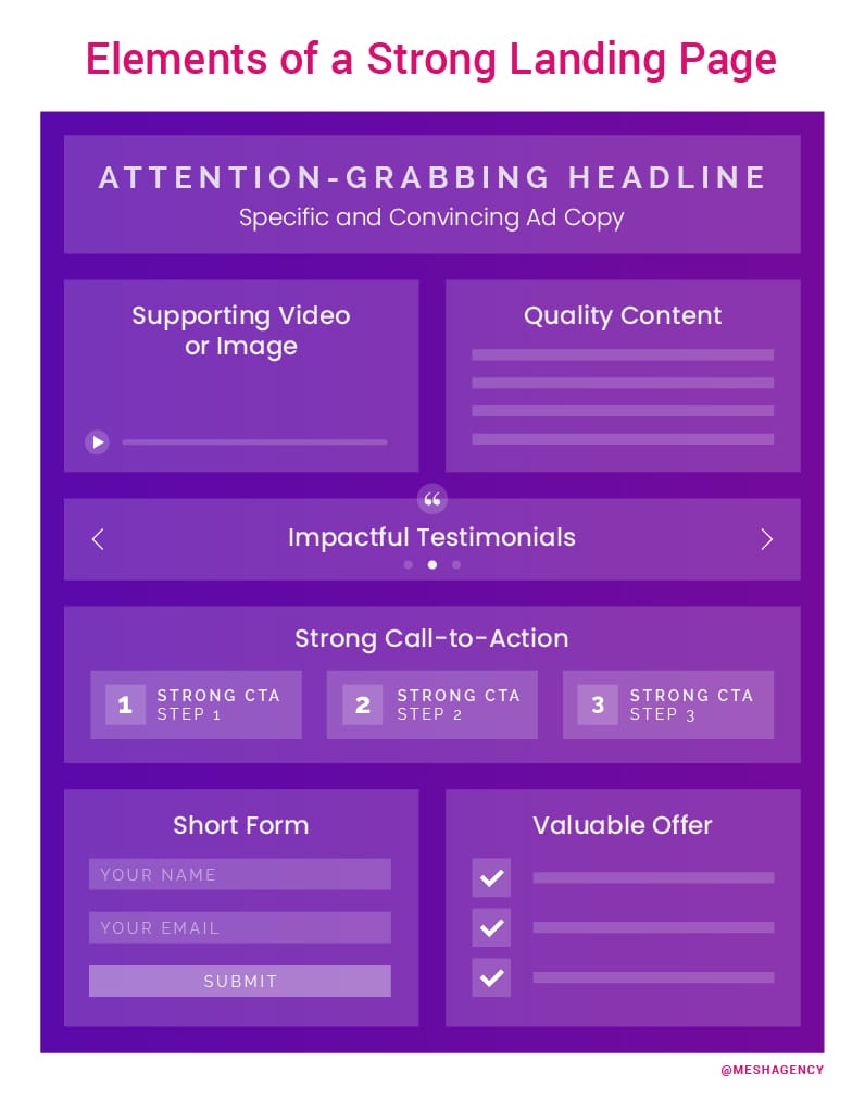
Every serious marketer understands the value of a strong landing page.
That said, understanding doesn’t always yield results and many marketers overlook critical details that would lead to the creation of a stronger landing page. As the adage goes, knowledge is power and, in this case, following this landing page checklist will help take a landing page from lackluster to lucrative.
Landing Page = Lucrative?
Yes — unlike a homepage, the entire crux of a landing page is conversion. In other words, when asking Why Should I Use Landing Pages:
If you consider the example of sending traffic to your homepage vs. a standalone landing page, you can understand that your homepage is designed with a more general purpose in mind. It speaks more to your overall brand and corporate values and is typically loaded with links and navigation to other areas of your site.
Visitors to a landing page should be invited to do something and that something should result in better (or more) business for you or your client.
As Neil Patel explains, “Rather than directing visitors from those sources to your general website (where they may have a hard time finding what they’re looking for), you can direct them to a specially-designed landing page that steers them in exactly the direction you want them to take.”
Essentially, it helps to think of the landing page as a shortcut to your latest offer, product or special. A landing page provides a direct route to this deliverable and saves your visitor from culling through the content on your website in order to find it, which they likely won’t take the time to do, anyway.
Why Leverage a Landing Page?
There are several reasons why a company or individual might benefit from a well-written landing page. For example, a company might need a landing page when offering something in addition to, or outside of the norm of, their usual offerings.
Take a local successful dental surgeon who requested a landing page for her website in order to inform her customers about a new financial package for uninsured clients. Given that this offer is not a one-time only or limited time special, a landing page is perfect to inform and then convert visitors to new clients. And, let’s be honest, not all of her clients need this offer (otherwise, she probably wouldn’t be in business). Remember, “Not all promos are for all people.”
But, this landing page works in targeting those who do need this offer but will not find it anywhere on her homepage or website.
It’s a specific, niche offering that requires a space separate, but connected to, her overall brand.
20 Tips to Lock Down that Landing Page
Even if you’re 100% on board with the value of a landing page, you’re probably overlooking some opportunities to elevate your content to conversion, as opposed to a few clicks. If you follow these checklist items to lock down that landing page, you should be set to deliver game-changing content that actually converts.
You’re welcome.
A Handy Helpline
All visitors to your landing page should have no trouble communicating questions, issues, and any other concerns right away. Ideally, visitors can click a conversation box and start a dialogue then and there. This makes them feel supported and stops them from clicking away from your page if they feel overwhelmed by a question or concern. Live chats are invaluable to keeping visitors on your landing page and empowering them to take action.
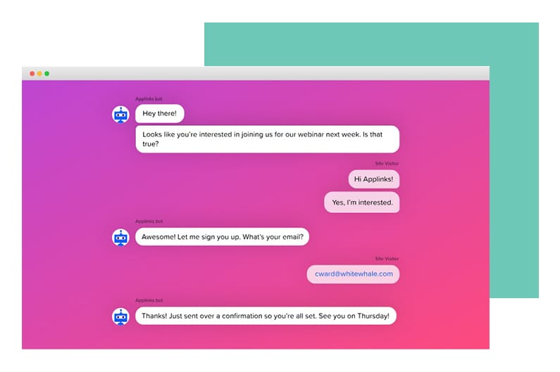
Ultimately, you can Create a Better Customer Experience with Live Chat Landing Pages because “…live chat integrations allow you to connect with people faster and in real-time, to answer questions and persuade them to convert.”
Rep Your Reputation
By showcasing a series of logos of well-known or identifiable clients who have done business with and thereby (hopefully) trust you, shines the spotlight on you as a solid collaborator for a business shopping your services. In other words, your landing page has the potential to set you apart from the competition. That’s why this content matters more than many businesses realize.
Video Demands “Action”
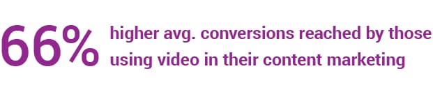
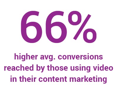
Consider this fact about video marketing: 54% of consumers want to see more video content from a brand or business they support. Featuring a short video on your landing page catches your viewer’s attention, keeping them on the page longer, engaging with your content. If that content is strong enough, engagement should equal conversion.
Serious conversion, in some cases. According to this video marketing stat from the Aberdeen Group, “Companies using video in their content marketing mix show a 66% higher average website conversion rate (4.8% vs. 2.9%).”
Bear in mind, no one is expecting a feature-length film here. Depending on the platform, you’re looking at a range of 30 seconds to two minutes. Totally doable.
Showcase Problem-Solving
Your prospect doesn’t really care about who you are or what you do, necessarily. They do, however, care very much about their problems and whether or not you have what they need to solve them. A solid landing page will present the solution to their problem, demonstrating a transformative potential that they do not want to miss out on — and so, therefore, must take action.
Check out your landing page as it exists now. What problem does it solve? Can you clearly trace a transformation, Cinderella-style? If not, better call in the woodland creatures and start from scratch.
Get Organized
Sloppy copy will not launch a successful landing page. Look at the content on your landing page and evaluate its overall organization. For instance, is your headline (which should be clear and clever) followed by a smart subhead? If so (and is it, really?) then does that subhead inspire you to keep reading — at least to the starting sentence? And from there, do you continue or click off?
Be honest with yourself as someone who is inundated with content every day, just like your visitors. Have mercy on them; streamline and strengthen those sentences, as well as the overall structure of your landing page.
Fun fact: a study detailed in The Human Brain is Loaded Daily with 34 GB of Information, discovered that, “people are every day inundated with the equivalent amount of 34 Gb (gigabytes) of information, a sufficient quantity to overload a laptop within a week.”
Do your visitors a favor — don’t overload them.
Show Yourself
You know who you are (or at least you think you do) and maybe your homepage nails it — but your landing page must make just as effective an introduction to your prospects. How can you extend a warm smile and solid handshake, digitally-speaking?
Simply by publishing any of your credentials, certifications, and experiences that support you as an industry authority. This is not bragging, rather you’re reassuring the prospect that you are the real deal. Oh, and don’t doubt for a second that your competition isn’t doing the same. Don’t be shy. This is your territory — stake your claim.
Roll out the Welcome Mat
Visitors to your landing page cannot waste a moment wondering if they have actually arrived at the right spot. Your job is to design a welcome mat of sorts alerting them that yes, they are, indeed, home. You can do this with pretty blunt language, “Attention ______________,” or by relying on familiar vocabulary and images.
Contrast is Key — Build a Better Button
No one should wonder if the button on your landing page is, in fact, a button. CTA buttons have very specific purposes, always designed for conversion. Ultimately, when it comes to CTA buttons, “The call to action is so important, so essential, and so overwhelmingly powerful that you should not attempt to make yours anything but a button.”
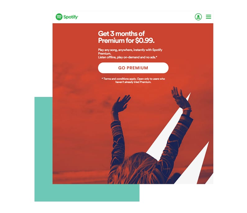
Do not conceal it — chances are, your landing page cannot afford a camouflaged CTA button. From a design perspective, you shouldn’t even be concerned with complementing the surrounding elements. An obvious (even obnoxious) color CTA button is crucial to your landing page. Be bold and build a better CTA button.
Keep it Simple, (you know the rest)!
When you think landing page, please, please follow that thought with “less is more.” There is no need to reinvent the wheel or clutter up the content with too much information. Keep it simple and straight to the point. There should be one clear, concise message in support of a single offer. That’s it. Review your landing page with this in mind. Isolate the message and identify the offer. Anything leftover, ax!
But Get Creative
Visitors are presented with CTA button text on just about every website they visit. That’s why, you want yours to be simple, but creative. More to the point, the content on the button should clearly state where the visitor is going once they click. Even though Wishpond lists the most effective buttons as: Start, Stop, Build, Join, Learn, Discover, you should challenge yourself to be more creative… and precise.
After all, with respect to the content on CTA buttons, “You have a limited amount of space in which to convey to a user why they should click on your button. You need to use that space to tell them exactly what they can expect if they take action.”
Going back to our dental surgeon example and the financial package for her uninsured prospective patients. Rather than relying on a tired, “Start” button, she tailored hers to “Sign Me Up!” which sounds friendlier, more action-driven, and… accepting of a demographic that has, up to this point, somewhat struggled to be included among the insured.
The “Start” button can be interchanged across a variety of industries and verticals, introducing all sorts of offers. In this case, “Sign Me Up” reads to visitors as an invitation that has been extended especially to them. It’s a little thing, but as we’ve been taught (by marketers), it’s the little things that matter.
No Static, Please
Any offer lost in translation quickly becomes a visitor…lost; therefore, a conversion missed. Do not make visitors to your landing page have to think. If your offer isn’t crystal clear, as in obviously understood within five seconds, it’s back to the drawing board with you!
Pull Out the Stops with Peer Pressure
Some call this getting social. Splash any street cred you have all over this landing page. Testimonials, a download count, your number of subscribers, “As Featured On” mentions — these name drops demonstrate to your audience that you’re one of the cool kids and they should totally want to sit with you at lunch… if there’s a seat at your table, of course.
A Caveman-Friendly Headline
Remember, Geico’s “So easy, even a caveman can do it” tagline? Well, that’s what you need to keep in mind when crafting a headline that will attract attention and reassure that your reader has arrived at the right place.
Go Easy on the Navi
Keep the focus on the message in order to keep visitors on your landing page. Too much landing page navigation tempts them to venture off the page, which will complicate your efforts to convert them. (there is a joke in here… we’ll let you fill it in as you see fit).
The Case for the Obvious CTA
Ideally, you want to position your CTA above the fold because the majority of visitors will not take the time to find it anywhere south of that. This is critical, especially if you’re making a free offer.
Present them with the opportunity before there is any need for them to scroll and you’ll stay ahead of the curve.
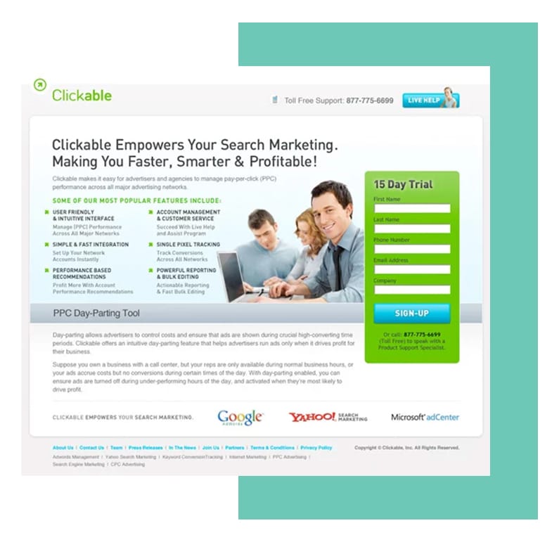
Target Your Visual Learners
While it’s absolutely true that compelling content is crucial to a landing page, there is also the need for visual support of your message. Graphics like boxes and arrows play a role in emphasizing key content for your visitors and prioritizing parts of your message over others.
Your Content Needs a Cape, aka the Hero Shot
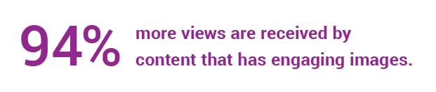
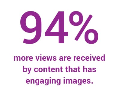
Convertful reminds us in How to Create a Hero Image That Drives Conversions, “When content has engaging images, it gets 94% more views.” With this in mind, do you want your content to stand on its own and run the risk of missing out on that viewership percentage? Consider your offer and determine whether your corresponding hero shot should be product, process or outcome-focused.
The key takeaway here is that your content and hero image need to align in a readily-identifiable connection. As Neil Patel observed, “Human beings have a natural tendency to follow the gaze of others, and we have been coached since birth to follow arrows directing us to where we should be looking/going.” Make sure your arrows, aka hero shot, point towards conversion.
Transparency is Tops
Ensure that any privacy policies and terms of service are clearly visible on your landing page for two reasons: 1) some sites required them for advertising rights; 2) they work wonders for conversions.
Avoid TMI
In other words, don’t solicit data that you have no intention of using. If you want to contact visitors via email, great. Ask for their email address, of course. Do you need their name, too? Well, do you intend to personalize any of your correspondence? No? Then nix the name request.
It’s a Match… At Least, it Should Be.
Make sure that whatever text and imagery you feature on the landing page matches the ad that enticed the visitor to this landing page in the first place. Anything that doesn’t match the original ad immediately undercuts expectations and calls the legitimacy of your landing page into question.
Be a Slave to Your Brand
Seriously. Don’t get slap-happy with your logo and brand it on every page, but do keep the colors, fonts, tone, etc., in line with the overall presentation of your brand.
Now You Can Get Social
We also call this tip “share and share alike.” Look, don’t put unrealistic expectations on your landing page — this content isn’t usually viral-fodder. However, there are those kind visitors who might click your social media share buttons, generally Facebook or Twitter, which means it’s your prerogative to make those buttons super easy to access.
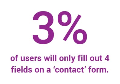
Mind Your Business
Any visitor asked to fill out a dozen form fields is more than likely going to click right off your landing page. Ain’t nobody got time for that. No, really– a form conversion report found that only 3% of users will even fill out 4 fields on a contact form. So be smart about the information your mining and keep your form fields short and sweet. That said, if for some reason you discover that you really do need more information than a typical contact form requires, you likely need to continue your content journey and put some time into progressive profiling.

Thank You, Come Again
Pay close attention the next time you leave your favorite restaurant, coffee shop or watering hole. Does the host or server thank you and invite you back? Even if it’s just a “thanks, see you soon!” the connection is made and the expectation for further, future interaction is established.
This is the same reason why your thank you page should do more than just thank your visitor for dropping by. Invite them to do or learn something while they wait to receive whatever it is you’ve offered. A too-quick thanks shuts down the conversation and makes it feel as though the connection ends there.
With this landing page checklist you can transform yours from lackluster to lucrative. Don’t know where to get started or what you need to focus on? That’s okay, we are here to help. Contact us today to get started on leveraging landing pages to improve your conversion metrics.
Marketing Agency
MESH is a digital marketing agency that has pioneered Account-Based Marketing via our proprietary Outcome Driven Marketing (ODM) methodology. We keep our focus on tightly integrating (or MESHing) lead generation, inbound, and outbound methodologies. We help you understand the hidden levers that impact your customers’ buying decision process, develop the right marketing strategy for your unique business case, and effectively execute and measure all aspects of your Account-Based Marketing program.